Guides
This page contains guides and code examples I have created over the past few years of teaching. It is not meant to be a linear or step-by-step system but rather it is organized into sections that correspond to the questions I receive most frequently. That being said, if you are completely new to coding, going down the guides in order would be a good way to start. The code examples are hosted on their own pages via GitHub and links to both the repository (where you can view and download the raw code) and the live site are provided for each. Scroll or click on the links below to go to jump to a given section:
Additionally, every heading and subheading are also links to themselves so you can easily bookmark a given section to refer to later or share with a friend.
Looking
This section covers how to look at code examples and sites you like in order to learn how they work (including this one!).
Using Your Browser's Inspection Tools
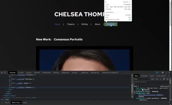
Most contemporary web browsers have a built-in inspector tool that allows you to look at the source code of a given page and hover over elements on the page itself to see the associated code. These tools are extremely useful both in exploring other people's sites and analyzing your own. It should be noted however that using the inspector on websites like Facebook, Twitter, CNN, or other large corporate sites will be much harder to read as much of their HTML and CSS is generated by other scripts in order to deliver dynamic content, ads, tracking, etc. This article from Hubspot does a good job of explaining how to use the inspector tools on Chrome, Firefox, and Safari:
https://blog.hubspot.com/website/how-to-inspect
Getting in the habit of using the inspector when you find something new or interesting on a site (or when you encounter a bug/glitch) can really help you see how code functions in a practical scenario.
Comments
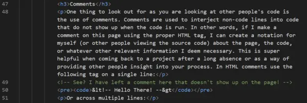
One thing to look out for as you are looking at other people's code is the use of comments. Comments are used to interject non-code lines into code that do not show up when the code is run. In other words, if I make a comment on this page using the proper HTML tag, I can create a notation for myself (or other people viewing the source code) about the page, the code, or whatever other relevant information I deem necessary. This is super helpful when coming back to a project after a long absence or as a way of providing other people insight into your process. In HTML comments use the following tag on a single line:
<!-- Hello There! -->Or across multiple lines:
<!--
Hello
There!
-->Comments are covered in greater depth in the coding section (including comments for CSS and JavaScript). In general, if you see code in gray when looking at the source, it is likely a comment.
Planning
This section covers basic things to consider when planning your site Depending on your idea and style of working, you may find you like much more (or less) planning:
- General Concept/Idea
- Outline & Wireframing
- Visual Style
- Hosting and CMSs
General Concept/Idea
Before getting into any code, it can be useful to consider what you want your website to do, who it is for, and why you are making it. This might seem like an obvious thing but the key is in the details. For example, when rebuilding my portfolio website from the ground up, I clarified my goals and it ended up having a big impact on my design. I went from my old website having the general goal of:
A professional looking website to showcase my work.
To a more specific goal of:
An intentional looking website, that centers sustainability, accessibility, and privacy, to showcase my work to potential collaborators, curators, artists, and academics.
The revised goal gave me a more clear focus. It did create some limitations but working within these limitations led to more interesting design choices. The end result is a website that is functional, visually engaging, and that aligns with my ethical stance in that it is more efficient and runs on green energy, is more accessible, and doesn't track users in any way. The goal might be rigid and utilitarian like mine or it might be more poetic/ephemeral but either way, a clear goal will make it easier for you to make design and content decisions moving forward.
Outline & Wireframing
An outline as I am conceptualizing it here refers to a document that helps plan/organize the content of a site itself. So, in the case of this page it would mean a document to plan and organize the text copy that you are reading now (including the headings and subheadings). In a primarily HTML and CSS site, this would be information that is found in the HTML and organized via tags such as img, h1, h2, p, li, etc. Having a clear outline, in addition to making it easier to write and organize documents/projects big and small, can make writing clear and accessible HTML a lot easier. This is a great resource for understanding how to write accessible HTML, this resource can also help you format your outline to make text accessibility easier to implement:
https://developer.mozilla.org/en-US/docs/Learn/Accessibility/HTML
For my outlines, I usually use Google Docs or a local text editor with Markdown syntax. The choice for me generally comes down to how text heavy the page is going to be. For something like this page which contains a lot of original text, I am using Google Docs for its grammar and spell check features. You can download a Google Doc as a web page but there are also extensions with more options for exporting content with HTML, I have had some good luck with this extension:
https://www.backlund.org/app.aspx?About=HtmlExporterAddOn
I use a local text editor (usually Sublime Text) when I have a little less text and am more interested in visualizing the hierarchy of headings, lists, etc as Sublime Text color codes Markdown syntax while still having a spell check function.
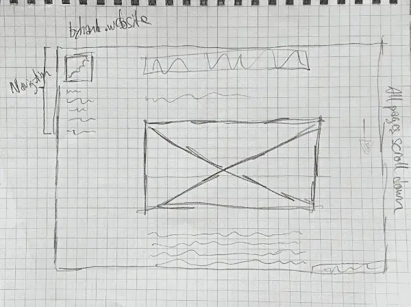
If an outline is for the text copy and media (in other words the HTML) the wireframe is for the visual design and overall layout (in other words where HTML ends and CSS begins). There is of course some overlap here in terms of what content goes into which section but in general that distinction works well for me. Typically, a wireframe starts out as just shapes and perhaps a few sparse words arrayed to reflect the proposed layout of a site. There are a variety of tools available for wireframing but a pen and paper is all you really need to get started. Typically, I draw out my ideas by hand before moving them into any software, this allows me to move through ideas quickly and not get bogged down with being too precise. The wireframe sketch for this found above gives just enough detail for me to begin writing CSS to place the HTML content into my desired format. More about wireframing can be found here:
https://careerfoundry.com/en/blog/ux-design/how-to-create-your-first-wireframe/
Visual Style
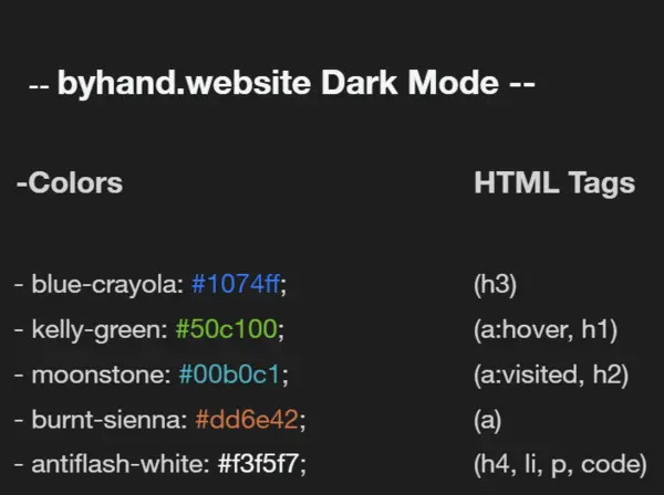
Once I have the general idea, content, and layout in mind, I like to turn to the visual elements to further flesh out what my site will look and feel like. The resources section has a large list of tools that can help on this front from color palette exploration tools, to ASCII art generators, to font collections and more. At this stage, the three main things I like to define are the font(s), colors, and any other distinct and persistent visual elements for the site. For byhand.website, I adapted the fonts and color palette from a visual design I generated for an example page a couple years back, adding two new colors to bring the overall color palette to five colors. After generating the palette, I also checked its contrast to ensure that my color combinations were visually accessible. More information on accessibility can be found in the Ethics section and tools for accessibility can be found in the Resources section. In these choices and in thinking through the wireframe, I pay attention to the elements and principles of design to guide my choices. The Berkeley Library has a nice brief guide here:
https://guides.lib.berkeley.edu/design
Hosting and CMSs
The last thing I am going to touch on in terms of planning is an aspect that can get a bit tricky as the number of hosting and content options can be overwhelming. If you are hand coding a site in HTML, CSS, and JavaScript, you will want to know where your site will be and how you want to update it. This site is housed in a repository on GitHub and uses GitHub Pages to host the live site. Updates are made by pushing changes from my local computer to the GitHub repository. I am using this system for a couple of reasons:
- GitHub is a platform I am already familiar and fluent with. I raise this point to say that, even if something might be technically “better” or “newer”, going with something you are already fluent with might be the better choice as it will make it easier for you to go from idea to finished project with greater ease.
- My site has a limited number of pages that I do not plan to update very often. If I was going to be making more regular updates or posts, I might want to use a static site generator to help me with content like Kirby or Jekyll. These CMSs help you create templates for pages that allow you to update and produce new content quickly. GitHub Pages is powered by Jekyll and allows you to quickly build sites for a repository from text and other files. In the case of this site however, I have created the HTML, CSS, and JavaScript directly and am only using Github Pages to host and serve the files.
- GitHub and GitHub Pages runs on sustainable energy and has a plan for going “carbon negative” within the next decade. This aligns with my politics surrounding making and hosting websites and is an important consideration for me and this project. More information about this can be found in the Ethics section.
With all hosting and CMS chives, the balance is between ease of use and features. If you are aiming for a fully hand coded site that doesn't require a server environment like Node.js, then GitHub Pages might be a good option. If you are looking for something that can handle more advanced configurations including Node servers or if you don't want to interface with Github, then Digital Ocean might be a good choice. This paid hosting service runs on renewable energy, has a variety of hosting options and prices, it is highly customizable, and has options for simple static sites as well as complex web apps. With any of these options, the basic workflow will be something like:
- Create the material for the site.
- Upload that material on a server.
- Host a site composed of the materials.
- Update as needed.
For GitHub Pages, my workflow looks like:
- Create a repository for my materials and add to it locally.
- Push updates to the public repository on GitHub.
- Use the settings on GitHub to activate a GitHub Pages site from the materials.
- Update the site by pushing edits and new material to the repository.
Coding
This section contains brief descriptions with accompanying links to code examples originally produced for some of my classes for the last few years. I have revised the examples to be more general and less class specific, that being said these examples don't cover every aspect of building your own website but I think they offer a good foundation to work from. All of my coding examples are hosted in GitHub and are published under an MIT License. Check out the resources section for more places to find hands-on examples.
Workspace
Before getting into coding itself, I wanted to take a minute to talk about my workspace and workflow. For all my code projects (online and offline, public and private) I use GitHub for version control and backup. Version control refers to a system that allows you to track, view, and restore changes in code and it is super helpful in coding for a variety of reasons but one of the main reasons it is so important is that it allows you to backtrack when things break. If GitHub feels like too much for you, simply having a dedicated folder on your computer will work too but it would be a good idea to backup it up somewhere after each working session.
To write code, I used to use a combination of Atom and Sublime Text. I really liked Atom for its handling of folders and multiple documents, customizability, easy live server, and integration with GitHub Desktop. However, Atom has recently been sunset and I have had to move on to Visual Code Studio. Like Atom, it is good at handling folders and multiple documents, is very customizable, and has an easy live server but I do find the interface to be a bit overwhelming. This is why I also use Sublime Text which I find to be more simple and straightforward, often allowing me to focus more tightly on the task at hand. It is also customizable and has an easy to use package manager. I mention these programs because I think they offer a lot of little things (such as color coding syntax) that make it easier to code but you can also get started with something as simple as Notepad on Windows or TextEdit on Mac.
Whatever my configuration, I find that having a live server to view changes is essential to making websites for me. Whether it's an integrated solution for something like Visual Code Studio:
https://www.geeksforgeeks.org/how-to-enable-live-server-on-visual-studio-code/
Or simply right clicking an html file you just wrote in NotePad and opening it with your browser, viewing how the browser translates your code into a render page is essential for learning and designing. So, regardless of your program choices or operating system, these are the three things you should probably consider when setting up your workspace:
- A text editor that feels accessible to you and that has the features you want.
- A method for viewing your code as a live website as you work.
- A system in place for backing up your work be it GitHub, Google Drive, or an external harddrive.
HTML and CSS
In this section you will find brief explanations (paired with links to code) of some basic web development concepts written in HTML and CSS. Again, all of these examples are released under an open source license (MIT License) and are free for you to use and remix.
Website Architecture
This example outlines a basic website structure using a simple file and folder structure and relative links to move between pages.
Repository: https://github.com/Chelsea-Thompto-Teaching-Examples/arch-demo
Live Site: https://chelsea-thompto-teaching-examples.github.io/arch-demo/
Navigation Bars
This example leverages CSS to show different ways of displaying the same HTML navigation bar.
Repository: https://github.com/Chelsea-Thompto-Teaching-Examples/navbar-demo
Live Site: https://chelsea-thompto-teaching-examples.github.io/navbar-demo/
Gallery Page
This example uses HTML and CSS to make a variety of image galleries that also feature hover interactions.
Repository: https://github.com/Chelsea-Thompto-Teaching-Examples/gallery-demo
Live Site: https://chelsea-thompto-teaching-examples.github.io/gallery-demo/
Website Templates
One page website template using HTML and CSS:
Repository: https://github.com/Chelsea-Thompto-Teaching-Examples/one-page-website-temp
Live Site: https://chelsea-thompto-teaching-examples.github.io/one-page-website-temp/
Multi-page website template using HTML and CSS:
Repository: https://github.com/Chelsea-Thompto-Teaching-Examples/multi-page-website-temp
Live Site: https://chelsea-thompto-teaching-examples.github.io/multi-page-website-temp/
JavaScript
And finally some guides for web-based visual experiences with JavaScript. These are not complete guides to the libraries discussed, if you are interested in learning more about p5.js and Three.js, check the resources page for more information.
Three.js Basics
This site contains some basic concepts for the Three.js library, a library for creating 3D spaces and renders online. The covered content includes loading custom models, different camera control configurations, visual effect overlays, as well as font and image loading.
Repository: https://github.com/Chelsea-Thompto-Teaching-Examples/threejs-boilerplate
Live Site: https://chelsea-thompto-teaching-examples.github.io/threejs-boilerplate/
“Game” movement with p5.js
This example demonstrates 4 types of game-like movement using user input in p5.js.
Repository: https://github.com/Chelsea-Thompto-Teaching-Examples/game-movement-p5js
Live Site: https://chelsea-thompto-teaching-examples.github.io/game-movement-p5js/
For Loop Chess Board
This example shows how basic coding concepts can be leveraged for visual/creative code projects. Focusing on the for loop, this example shows how a chess board can be made using for loop logic across standard JavaScript, p5.js, and Three.js.
Repository: https://github.com/Chelsea-Thompto-Teaching-Examples/chess-board-example
Live Site: https://chelsea-thompto-teaching-examples.github.io/chess-board-example/
Miscellaneous
A section for guides that do not fit neatly into the above sections.
Web Ready Media
File formats and best practices can change over time so it is best to consider the following when adding media to your site:
Where are you storing and backing up high-quality versions of your work?
The answer to this is likely not your public facing website and if it is, you should reconsider. It is best to think of your website as a place to display screen-friendly versions of your media rather than the highest quality revision you have. So, it is helpful to think of your offline archive of work as the source material for the online versions. In other words: producing web ready images from archival ones.
What formats and sizes are you using?
This can have a big impact on page size, loading speeds, and cross-platform viewability. In the past, .jpeg and .png were the preferred format for still images because of their balance between size and quality. Recently however, the format .webp has become increasingly popular as it generally produces higher quality images for even less space than .jpegs and .pngs. Formats can be a moving target but in general, these are the file types that are currently most common on the web:
- Images: .webp, .jpeg, and .png
- Videos: .mp4, .webm, and .gif (although .gifs are sometimes treated as still images)
- Sound: .mp3, .wav, .mp4, and .webm
- 3D Models: .gltf
Whatever formats you choose, properly sizing your images is also important. If you have an image that is in a web ready format but is 4000 pixels in width, the image is either going to spill off the edge of the screen or be resized by your HTML and CSS to fit, either way much of this resolution will be wasted. This is because most screens are not 4000 pixels wide and in fact will likely be 1980 pixels or less. So, resizing photographs to the dimensions they will be displayed can help further decrease page size and load time.
Have you written meaningful alt text?
After you have produced your images in the desired format and size, you will need to integrate them into your project itself. When doing this, it is critically important to consider the alt text attached to a piece of media. Writing good alt text will increase the accessibility of your site and ensure that all users can experience your project.
Endnotes
This page will be updated periodically with new material and revisions as technology changes. If you notice a link not working or information that is out of date, please drop me a line at: chelseathomptoart(at)gmail(dot)com.